
Fossil Fuels
Top Coal Consuming Countries
China consumes more coal than the rest of the world combined. Coal remains the backbone of many economies.
Watch how countries rank over time across key energy indicators. Each animated chart shows the Top 15 countries racing for position year by year.
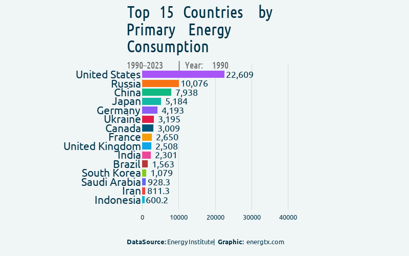
Top 15 countries by total primary energy consumption in TWh, showing how energy demand has shifted over decades.
TWh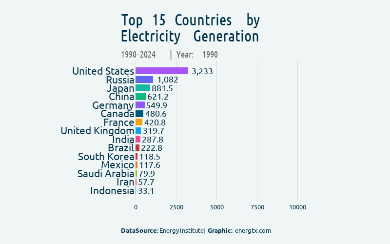
Top 15 countries by total electricity generation, revealing the rise of new industrial powerhouses.
TWh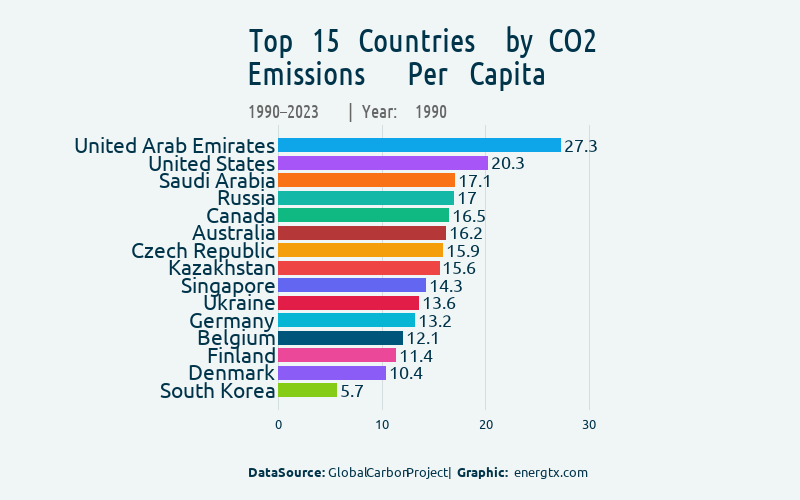
Top 15 countries by per-capita carbon dioxide emissions — a key measure of carbon footprint.
metric tons per capita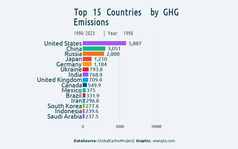
Top 15 countries by total GHG emissions including CO2, methane, and other greenhouse gases.
Mt CO2eq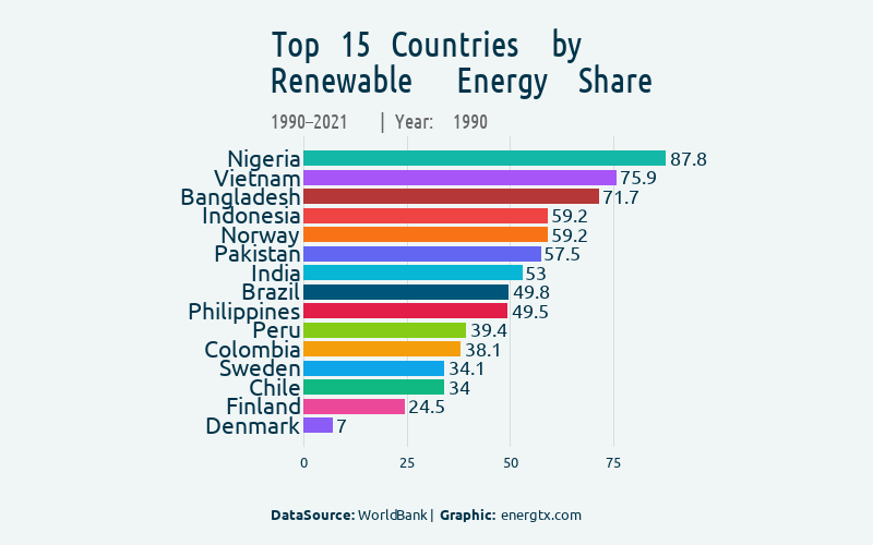
Top 15 countries by share of renewable energy in total consumption — tracking the clean energy transition.
%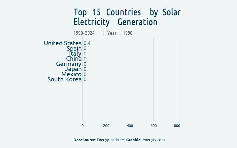
Top 15 countries by solar power generation, showing the exponential growth of solar energy.
TWh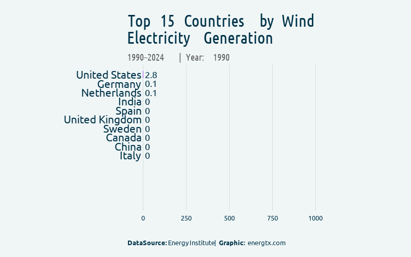
Top 15 countries by wind power generation, tracking the expansion of wind energy capacity.
TWh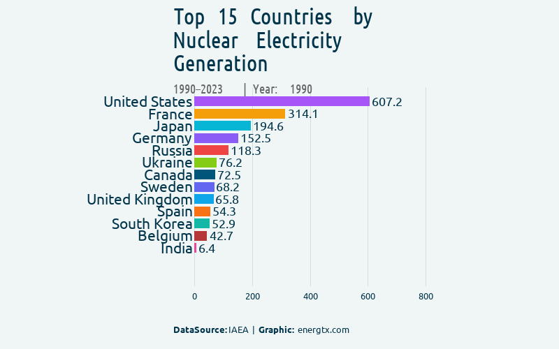
Top 15 countries by nuclear power generation — a major source of low-carbon electricity.
TWh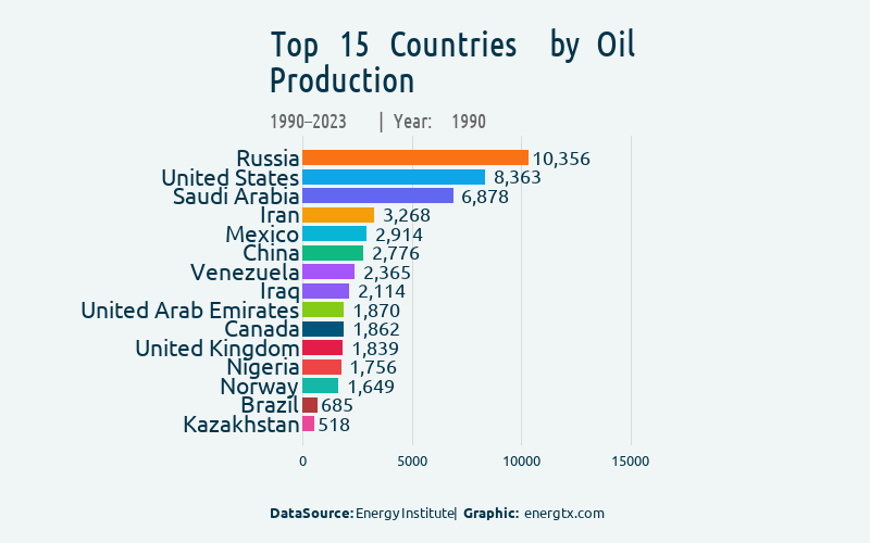
Top 15 countries by oil production in thousand barrels per day, showing shifts in global oil supply.
thousand barrels/day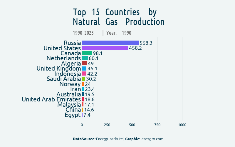
Top 15 countries by natural gas production, reflecting the growing role of gas in the energy mix.
bcm90+ infographics covering electricity mix, emissions, renewables, fossil fuels, country comparisons, growth rankings, and more.
102 infographics
China consumes more coal than the rest of the world combined. Coal remains the backbone of many economies.

US, Russia, and China lead global natural gas consumption. Gas is cleaner than coal but still a major CO2 source.

The US alone uses ~20 million barrels/day. Global oil demand is not peaking yet.

Diesel keeps the world moving — trucks, ships, industry. A direct indicator of industrial and transport activity.

Motor gasoline consumption reflects car culture. The US dominates by far.

LPG powers billions of kitchens and heaters — a vital fuel in developing countries.

Some countries get 95%+ of energy from fossil sources. The transition is not happening at the same speed everywhere.

Some countries are peaking, others still growing fast. The energy transition is anything but uniform.

Installed fossil capacity means infrastructure lock-in. These plants run for decades unless retired early.

While the world talks climate action, fossil fuel subsidies keep rising. The numbers are staggering.

US, Russia, and China hold the largest reserves — centuries of potential emissions, or stranded assets.

These countries ship millions of tonnes yearly — fueling power plants across Asia and Europe.

Despite climate pledges, coal imports remain huge. These countries depend on foreign coal.

US and Russia dominate, accounting for ~40% of global natural gas output.

Gas exports shape geopolitics, trade routes, and energy security worldwide.

These nations rely on imported gas — vulnerable to supply disruptions and price shocks.

The hidden cost of oil: CO2 from petroleum combustion. Transportation and petrochemicals are the main culprits.

China has more solar panels than the next 5 countries combined. The fastest infrastructure expansion in history.

The world is building wind farms at record pace. China leads. Offshore wind is the next frontier.

Hydropower is the world's largest clean electricity source. China, Brazil, and Canada lead.

China has built more hydro capacity than any country in history — the foundation of clean power.

China's hydro buildout has been extraordinary. Established hydro powers maintain steady output over 30+ years.

Unlike solar and wind, geothermal runs 24/7 — clean power from the Earth's heat.

Brazil and the US lead global biofuel consumption — critical for decarbonizing transport.

Wood chips to municipal waste — these countries turn organic matter into serious power.

These countries invested most in turning organic waste into electricity.

Strip out hydropower — who leads in wind, solar, geothermal, and biomass?

Total capacity favors big countries. Per capita tells a different story about clean energy commitment.

Renewable electricity generation is accelerating. Top 5 countries have scaled up dramatically over two decades.

Some countries get 50%+ from non-fossil sources. Nuclear + renewables = the clean backbone.

US and France lead, but China is building new reactors faster than anyone else.

China now consumes more electricity than the US and EU combined. Electricity = economic activity.

Gulf states and Nordic countries top the list. Per capita reveals more than total consumption.

Hundreds of millions still live without electricity. Energy poverty remains a massive global challenge.

Some countries power their neighbors through electricity exports. Cross-border trade is key to energy security.

Energy interconnection reveals hidden dependencies between nations.

Transitioning away from coal power is the single biggest lever for cutting emissions.

Some countries are almost entirely dependent on gas for power generation. Is that sustainable?

Some countries are almost 100% hydro-powered. Geography is destiny for clean electricity.

Oil-fired power is the most expensive and carbon-intensive way to make electricity.

Energy production determines geopolitical power. These 10 countries dominate global output.

Gulf states and cold-climate countries top the list. Wealth, climate, and lifestyle drive consumption.

Some nations import nearly all their energy. Energy security is a matter of economic survival.

After conversion losses, this is energy reaching end users: transport, industry, buildings.

These countries generate the most GDP per unit of energy. Efficiency is the cheapest clean energy.

Some economies generate 10x more emissions per unit of GDP than others.

Innovation drives the energy transition. These countries spend the most on energy research and development.

DR Congo produces the majority of the world's cobalt — critical for EVs and energy storage batteries.

China dominates rare earth production. Essential for wind turbines, EV motors, and electronics.

Just 10 countries produce the majority of global emissions. Climate accountability starts with data.

Including methane, N2O, and F-gases — per capita changes the ranking dramatically.

Methane is 80x more potent than CO2 over 20 years. From agriculture, fossil fuels, and waste.

Electricity generation is the largest source of energy emissions. Decarbonizing the grid is priority #1.

Cars, trucks, planes, ships — transport emissions are growing faster than any other sector.

Steel, cement, chemicals — industrial processes are incredibly hard to decarbonize.

Livestock and rice paddies produce massive methane and N2O. Food systems need a climate strategy.

Heating, cooling, lighting — energy-efficient buildings are a key climate solution.

Landfills generate significant GHG emissions. Circular economy is a climate imperative.

Deforestation is a climate emergency. Forestry and land use emissions are massive — and often overlooked.

Extraction, processing, and distribution produce enormous emissions — before the fuel is even burned.

36% coal, 21% gas, 19% hydro, 19% renewables. Still heavily fossil-dependent, but wind and solar are growing fast.

26% coal, 16% gas, 36% renewables (excl. hydro). The Energiewende in action — but coal is still a major player.

64% nuclear — the highest share among major economies. Coal is nearly zero. Decarbonized power.

61% coal, 14% hydro, 13% renewables, 5% nuclear. Still coal-dominant despite massive renewable buildout.

42% gas, 17% coal, 18% nuclear, 14% renewables. Natural gas has replaced coal as the dominant power source.

74% coal — the highest among major economies. Solar and wind are growing fast, but coal remains king.

33% gas, 28% coal, 8% nuclear (post-Fukushima recovery), 13% renewables. Diversified but still fossil-heavy.

60% hydroelectric — one of the cleanest grids in the world. When nature provides the power, emissions stay low.

38% renewables, 35% gas, 14% nuclear, under 2% coal. From coal birthplace to renewables leader in two decades.

34% coal, 30% nuclear, 26% gas. Renewables at just 6%. One of the most nuclear-dependent economies.

Similar population, different energy stories. How do they compare on consumption, emissions, and renewables?

The great European energy debate. Germany chose renewables. France chose nuclear. The data shows what happened.

Both oil-rich, but completely different energy paths. One went clean, one stayed fossil.

Two Asian energy giants compared. Similar challenges, different strategies. Nuclear plays a big role in both.

Europe's energy divide in one chart. Coal-heavy vs nuclear+hydro. The contrast couldn't be starker.

Two emerging giants, different energy DNA. Brazil has hydro. Indonesia has coal. Both are growing fast.

Some countries saw 10,000%+ growth since 2013. The solar revolution is global — and accelerating.

New players are emerging. Wind energy is no longer just a European story.

Proof that decarbonization is possible. Some countries achieved 30-40% reductions in a decade.

From nearly zero to meaningful — the energy transition is real in these nations.

From under 7 cents/kWh to nearly 14 cents. Average US electricity price over time.

American households now pay over 17 cents/kWh on average. The upward trend continues.

Volatile and trending up. Gas prices directly impact millions of American homes.

At an all-time high — but renewables still make up a fraction of total US energy.

The shale revolution made the US the world's largest energy producer. The chart tells the story.

America's oil appetite peaked and plateaued. Will it finally decline?

Which countries grew energy consumption the most in a decade? Some economies expanded dramatically.

These countries proved that cutting emissions while maintaining prosperity is possible.

Not everyone is moving in the right direction. The data is sobering.

Rising energy use per person = rising living standards? Or rising inefficiency?

US 13,573 KB/D, Russia 10,132, Saudi Arabia 9,482. Who produces the world's oil? JODI data ranking of the top 15 crude oil producing countries.

China 11,445 KB/D, US 6,167, India 5,001. The countries most dependent on crude oil imports — and most exposed to the Hormuz disruption.

Not just crude — gasoline, diesel, jet fuel, LPG combined. The US alone consumes ~20M barrels/day. Hormuz disrupted ALL product flows simultaneously.

Diesel keeps the world moving — trucks, ships, industry, agriculture. When oil prices spike from $63 to $126/bbl, diesel hits the real economy first.

20 years of crude oil production. The US shale revolution transformed global supply. Russia peaked. Saudi Arabia manages output. Now Hormuz reshuffles everything.
Red = 80%+ imported = critical vulnerability. These countries feel the Hormuz crisis hardest. Renewables are energy security, not just sustainability.

Green = production, Red = demand. The gap shows net exporters (Saudi, Iraq, UAE) and net importers (China, India, Japan). A single chart that tells the whole story.

US = gasoline nation (8,949 KB/D). India & Germany = diesel economies. Two fuel cultures, both disrupted by the Hormuz crisis.

US: 680M barrels. Japan: 341M. Russia: 218M. Strategic + commercial reserves that buffer against supply shocks. IEA released 400M — covers ~4 days of global demand.

US 17,991 KB/D, China 15,689. Refining is the invisible backbone of the oil economy. Hormuz disrupts the feedstock that keeps refineries running.

China surpassed the US in 2017 and never looked back. India tripled imports since 2005. All five top importers are exposed to Hormuz.

Gasoline, diesel, kerosene, LPG, fuel oil — stacked by country. The Hormuz crisis disrupts ALL product categories, not just crude oil.
Charts generated from 170,000+ data records across 56 countries using R + ggplot2.